Working from Home? Welcome to My World
Jake Savin has a blog post up about working from home, something he began doing as a developer at UserLand Software in 2000 coding the blogging platform Manila and other products. Though it wasn't a remote position when he began the job, that soon changed:
The company actually had an office when I was hired, and I had my own space with a desk and a door, a desktop computer, etc. There were only two of us in the office though, and it quickly became clear to me that the value of driving 35-40 minutes each way from my apartment to the office and back just wasn't worth it. So a few weeks in, I drove there one Saturday, packed up the computer and took it home, and never went back. From that point my productivity and focus increased. By a lot.
I've been working from home for decades, first as a computer book author and web publisher and now as a ServiceNow application developer. My morning commute is the thirteen steps I take from the master bedroom to my keyboard.
Jake has some good advice for those new to the experience of being at work while being at home, in particular the call to remember to stop working.
Working from home can erode the boundary between work time and off time. At first you might just fire up the computer occasionally to complete a task or catch up on something you couldn't get done on a day packed with long conference calls. But at some point you start feeling like your extra time is fair game, so you make different decisions about what to get done during the workday. I find this particularly true of programming, which often has blocks of time where you're writing a piece of code and don't need more input from coworkers until it's ready to show them.
Losing the boundary can make all time seem like work time and lead to burnout. I once worked at a startup that had a product launch at an industry conference considered make-or-break for the company. I worked 12 hours a day for 40 consecutive days to get that done along with my other projects. By the time of the event, I was debugging JavaScript in my dreams and had the pallor of an extra on the Walking Dead who died of scurvy.
That's not an experience I recommend. You can't outrun the law of diminishing returns.
Things are better these days. I hear the five o'clock whistle no later than six.
Whatever Happened to the Blogroll?
One of the side effects of reviving an old site design on Workbench is that this blog has a blogroll again. Bloggers used to put a long list of links on their homepage to other blogs they read (or wanted you to think they read). I don't know why everybody stopped doing that. Since I was borrowing an old design from 2008 I decided to bring back the blogroll too.
I used the same blogroll but dropped the sites that are inactive or gone after 12 years, leaving these 20 diehards:
- A Whole Lotta Nothing
- Andrew Connell
- BillSaysThis
- BurningBird
- Curt Jester
- Freeform Goodness
- iRights
- Jack William Bell
- Jason Shellen
- Jonathan Bourne
- Kottke.org
- Lies.Com
- MediaJunkie
- MetaFilter
- News From ME
- Nice Marmot
- RasterWeb
- TechDirt
- VoidStar
There are a lot of personal blogs in this roll, including three locals from Jacksonville, and a few big names from the earliest days of blogging that are still publishing such as TechDirt, MetaFilter and the unstoppable Jason Kottke.
Most of the other blogs are a lot like Workbench -- updated sporadically and sometimes apologetically by one person in their spare time. The impulse to keep up a personal blog is harder to sustain these days when Twitter, Facebook and Instagram are bringing millions of people together and dispensing the continuous dopamine drip of retweets and likes so they never leave.
Being a blogger in 2020 is like being Free Trader Beowulf, sending out a distress signal from deep space and not knowing if it ever will be heard.
Upload: Do You Really Want to Live Forever?
I just finished watching the 10-episode first season of Upload, which just got renewed for a second on Amazon Prime only seven days after its debut.
The show's an oddball take on the afterlife in which anyone can be uploaded to a virtual world shortly before death and still interact with their loved ones. Robbie Amell plays a handsome but shallow app developer who dies under suspicious circumstances in his self-driving car. Andy Allo is his "angel," the tech support rep guiding him through his second life.
There are afterlife worlds for many different budgets, though even the toniest is pleasant on the surface but dire underneath. Amell's girlfriend pays for his continued existence and thus has total control, which inspires her to say for the first time "I love you." When he expresses surprise that she level-jumped their relationship, she replies, "It's not like I can scare you off with that any more."
The biggest laughs come from how horrible the world has become in 2033. This extends to the afterlife, where there are floating three-dimensional banner ads, Taco Bell cheesy gordita upsells and corporate exploitation of private thoughts so relentless Mark Zuckerberg will be upset he didn't think of it first.
Allo's really good as the young tech who starts to fall in love with her client despite being told that long distance living-dead relationships never work.
After The Good Place, I didn't think I needed another afterlife series but I like that I can't figure out what Upload is supposed to be. It's genuinely funny at times but the characters inhabit a world as dark and divided by class as Terry Gilliam's Brazil.
After it ended on a killer cliffhanger I'm looking forward to the second season, which is likely to take awhile with TV production closed down for the pandemic.
Workbench is Going Back to 2008
This blog has needed a new look for a long time, but I've had a creative block about what I wanted that look to be. Like millions of other people I'm staying home during the pandemic (and I hope you're doing the same). With lots of free time on the weekends and no sports parking me on the couch, I'm tinkering with old websites and servers again. This weekend I finally found a web design I liked for Workbench.
The one it had in 2008.

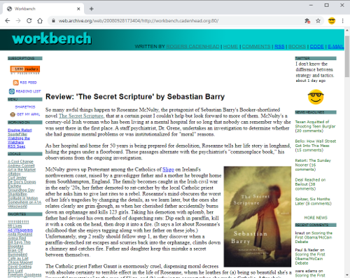
This is a screen capture of the Workbench front page from Sept. 28, 2008, in the Internet Archive. When I saw it on Sunday, I wondered how difficult it would be to create the same design from scratch with Bootstrap 4, throwing out the rickety old HTML tables and inline styles and replacing them with CSS from the popular framework. So I started creating the HTML and CSS to do this, beginning with the main body of the page and working my way outwards to the sidebars and banner.
As I did, the effort started to seem less like an experiment and more like a master plan.
I tried to be faithful to the original while making some concessions to the modern web. I thought having two sidebars was too much for a site that needs to be readable on phones, so I consolidated them into one. That sidebar also disappears below a specific screen width -- a built-in feature of Bootstrap.
The most interesting part of the design was learning how to recreate the banner atop the page without using any image files.
That wasn't something I was planning to do, but when I tried to make the original graphic work on all screen sizes, it was an unholy mess. When it looked like I'd need to create the same logo in multiple sizes, I realized I could probably find a web font to use with a CSS style that specifies a gradient.
This CSS style is all that's required to create the banner graphic:
banner {
    background-image: linear-gradient(90deg, #003333, #00CCCC);
    font-family: CCHeroSandwichMeat;
    font-size: 90%;
    text-transform: uppercase;
}
The font is Hero Sandwich Meat by the comic book lettering company Comicraft. It's close to the original, whose name I can't remember, and available as a webfont.
I'm still incorporating the design on the other pages and should have it done this weekend.
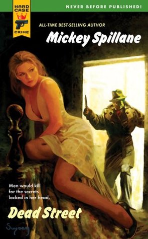
Review: 'Dead Street' by Mickey Spillane
 This Mickey Spillane novel was finished after his death by his friend and fellow crime novelist Max Alan Collins. It was part of the early rollout of Hard Case Crime, a fun imprint of pulp mysteries and hard-boiled crime fiction with charmingly lurid cover art. The story's a brisk read with the cynicism and Chandleresque patter one expects from a writer like Spillane, but the plot feels like something that wasn't fully baked yet.
Retired New York police detective Jack Stang moves to Florida, right next door to the love of his life 20 years after she was believed dead following her kidnapping by mobsters. This is no coincidence, but instead the first in a set of events set into motion that lead to a widening conspiracy involving national security, old mobsters, and old cops. You'll never read a novel where a man who thought his true love was murdered, and a woman who has developed blindness and amnesia to forget him entirely, pick things up more easily. Perhaps I'm conditioned by soap operas to expect a reunion like this to play big, but Spillane and Collins make it seem as mundane as a pair of high school sweethearts running into each other again at their 20-year reunion.
I've Disappointed a Comment Spammer
Though I haven't been blogging actively in recent years I've been cleaning out the comment spam regularly because I'll eventually be writing here again.
This morning I found this gem on a comment touting a cheesy online Flash games site:
The next time I read a blog, I hope that it doesn't disappoint me as much as this one. I mean, I know it was my choice to read, but I actually thought you'd have something interesting to say. All I hear is a bunch of whining about something that you could fix if you weren't too busy looking for attention.
The post was a movie review. A Google search reveals the spammer has been posting this insult for years.
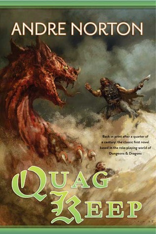
Review: 'Quag Keep' by Andre Norton
 This 1978 novel, the first ever written for a role-playing game, may still be one of the worst four decades later. The esteemed SF/F author Andre Norton was introduced to the first edition of Dungeons & Dragons by co-creator Gary Gygax. After a play session, she wrote a novel from her limited understanding of the rules about characters who don't know their lives and world are a game. That sounds intriguing but the novel isn't. It devotes less than 20 pages at the beginning and end to exploring the premise.
Instead, it's a plodding tale of an adventuring party dragged across the World of Greyhawk by a geas with bracelets holding RPG dice fixed to their wrists. The characters in the group were hard to tell apart, aside from a berserker were-boar and stoic lizard man named Gulth. The punishment he silently endured when forced to travel through a harsh, dry clime, far from swamps, was evocative and memorable. I read this in the '80s and didn't recall any of it. I'll likely forget it again.


