Workbench is Going Back to 2008
This blog has needed a new look for a long time, but I've had a creative block about what I wanted that look to be. Like millions of other people I'm staying home during the pandemic (and I hope you're doing the same). With lots of free time on the weekends and no sports parking me on the couch, I'm tinkering with old websites and servers again. This weekend I finally found a web design I liked for Workbench.
The one it had in 2008.
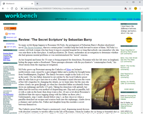
This is a screen capture of the Workbench front page from Sept. 28, 2008, in the Internet Archive. When I saw it on Sunday, I wondered how difficult it would be to create the same design from scratch with Bootstrap 4, throwing out the rickety old HTML tables and inline styles and replacing them with CSS from the popular framework. So I started creating the HTML and CSS to do this, beginning with the main body of the page and working my way outwards to the sidebars and banner.
As I did, the effort started to seem less like an experiment and more like a master plan.
I tried to be faithful to the original while making some concessions to the modern web. I thought having two sidebars was too much for a site that needs to be readable on phones, so I consolidated them into one. That sidebar also disappears below a specific screen width -- a built-in feature of Bootstrap.
The most interesting part of the design was learning how to recreate the banner atop the page without using any image files.
That wasn't something I was planning to do, but when I tried to make the original graphic work on all screen sizes, it was an unholy mess. When it looked like I'd need to create the same logo in multiple sizes, I realized I could probably find a web font to use with a CSS style that specifies a gradient.
This CSS style is all that's required to create the banner graphic:
banner {
    background-image: linear-gradient(90deg, #003333, #00CCCC);
    font-family: CCHeroSandwichMeat;
    font-size: 90%;
    text-transform: uppercase;
}
The font is Hero Sandwich Meat by the comic book lettering company Comicraft. It's close to the original, whose name I can't remember, and available as a webfont.
I'm still incorporating the design on the other pages and should have it done this weekend.
Add a Comment
All comments are moderated before publication. These HTML tags are permitted: <p>, <b>, <i>, <a>, and <blockquote>. This site is protected by reCAPTCHA (for which the Google Privacy Policy and Terms of Service apply).
![]()
Social Media
![]()
Subscriptions
Blogroll
Projects
Statistics

This blog has been published since Nov. 7, 1999 (a span of 9,756 days).
Thank you for visiting Workbench.
