Using Treemaps to Visualize Complex Information
I spent some time today digging into treemaps, a way to represent information visually as a series of nested rectangles whose colors are determined by an additional measurement. If that explanation sounds hopelessly obtuse, take a look at a world population treemap created using Honeycomb, enterprise treemapping software developed by the Hive Group:
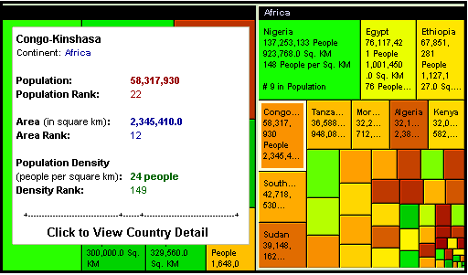
This section of the treemap shows the countries of Africa. The size of each rectangle shows its population relative to the other countries. The color indicates population density, ranging from dark green (most dense) to yellow (average) to dark orange (least dense). Hovering over a rectangle displays more information about it,.
A treemap can be adjusted to make the size and color represent different things, such as geographic area instead of population. You also can zoom in to a section of the map, focusing on a specific continent instead of the entire world. The Honeycomb treemapping software offers additional customization, which comes in handy on a Digg treemap that displays the most popular links on the site organized by section.
By tweaking the Digg treemap, you can see the hottest stories based on the number of Diggs, number of Diggs per minute and number of comments. You also can filter out results by number of Diggs, number of Diggs per minute or the age of the links.
I don't know how hard it is to feed a treemap with data, but it seems like an idea that would be useful across many different types of information. As a web publisher, I'd like to see a treemap that compares the web traffic and RSS readership my sites receive with the ad revenue they generate. The Hive Group also offers sample applications that apply treemaps to the NewsIsFree news aggregator, Amazon.Com products, and iTunes singles. This was not a good day to be a Jonas Brother.
Comments
I have this slow burn project to do a squarified treemap of the federal budget, where color represents %age change from the prior year's budget, assuming that the categories / labels of the departments stay reasonably stable year over year.
If you want to try out your data with heat maps, you can download our Heat Map Explorer at www.labescape.com This will allow you to import data from any Excel or CSV file.
Regarding the comment on the Federal budget. I did a heat map of this a couple years back. I'll see if I can dig it up, add in the new data and post a link.
Add a Comment
All comments are moderated before publication. These HTML tags are permitted: <p>, <b>, <i>, <a>, and <blockquote>. This site is protected by reCAPTCHA (for which the Google Privacy Policy and Terms of Service apply).
![]()
Social Media
![]()
Subscriptions
Blogroll
Projects
Statistics

This blog has been published since Nov. 7, 1999 (a span of 9,631 days).
Thank you for visiting Workbench.
